Simple and stylish.
They would work better reversed though.
Use the circle for cash (more like a coin) and the moon for Safex token.
1 Like
Why not use the original logo as the safex cash logo with a ring around it
and use the big dot  for the safex token logo
3 Likes
I like both options which may be necessary with the mono versions to be used for embossing / debossing onto tangible products ie. notebooks
The blue version is another option for printed matter or screen representation.
2 Likes
I like the token, its clean and bold. However, I think the Safex cash logo may need some rethinking. My thoughts are similar to the previous comments, seems too busy. Nice work tho!
1 Like
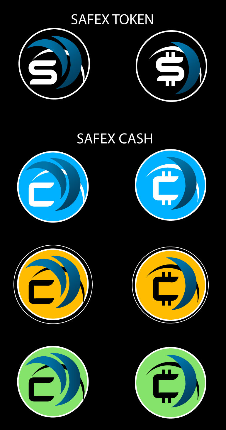
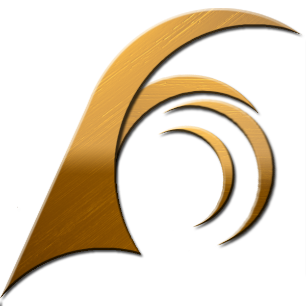
I like the idea of the moon and fulll moon , the gold gives some prestige and elegance but reminds me more of golden credit cards… The safex cash logo will be outside of every shop window around the world saying safex cash accepted here! not to mention the platforms for online payments. So take your time cause this is huge .
2 Likes

Some proposals… Working with the wallet logo.
3 Likes
I think we need to distinguish token and cash, but also logos should resemble each other. I’m not a fan of this logos with letters, I think Nikola’s proposal is very good. It is subtle, but powerful and memorable.
6 Likes


Another idea, using the other wallet logo.
1 Like
I think there should be text distinguishing Safex Cash from Safex Token and/or the logo’s should be easily distinguishable by someone totally new to the blockchain space. I also believe that the simpler the Cash design, the more likely people will see it as exchangeable currency. Logos for all fiat currencies, and Bitcoin have simple looking symbols/logos.
2 Likes
Small triangles are for a Concrete base, this was just for a laugh but its mine.
1 Like
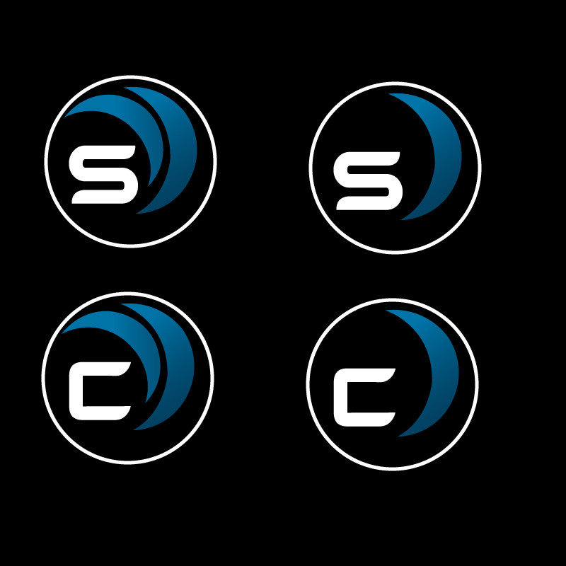
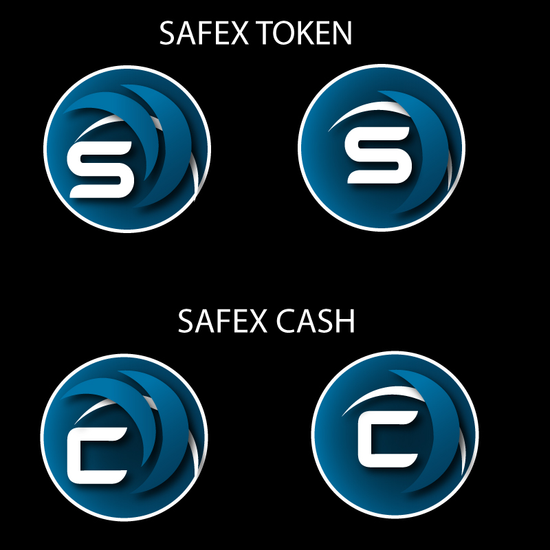
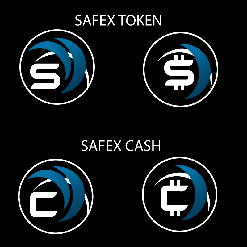
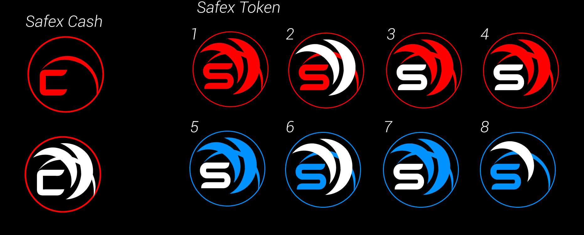
THE SAFEX TOKEN

The Safex Token has two sails, with a circle surrounded by a moon.
The circle is the world, with the sails covering it. It’s to show that Safex is global. The moon indicates a goal to achieve and how Safex will forever push forward to achieve great things.
3 Likes
SAFEX CASH
The Safex cash logo has two sails, but this time two rings. This is so show the transfer of one safex cash from one person to another.
4 Likes
Ha ha ha your the first to cop it
1 Like
This logo is the best i seen for Safex, should definitely be considered
2 Likes
Well done, Kenny! Like them very much.
3 Likes
@dandabek I like that idea a lot, in reference to the ring around Safex Cash and the big dot for the Safex Token!
Some folks have advocated for the inclusion of words or letters, which is cool but then there is the problem of culture. Safex will be universal in scope so how could you fairly represent all the different languages and cultures?
Once the logos for Safex Cash and Safex Token become universally established it should become self evident.
2 Likes
Its silly to use letters or words since not everyone speaks English. Safex is supposed to be global…
2 Likes
Bit of a ill informed statement when Bitcoin is represented by the letter " B " and the whole global audience knows about that regardless if they speak english or not. Your point does not stand
1 Like