Safex Cash / Safex Token logo suggestions

Greetings everyone; we have two proposals from our Chief Designer, Nikola:

The first one is for Safex Cash and the second is for the Safex Token. Please offer your comments praise and criticism is most welcome :slight_smile: :sunrise_over_mountains:

These are only a proposal and in no way the final take!


These are only a proposal and in no way the final take!

9 Likes

As I like the blue color (nearly every crypto has a colored logo), this would be my proposal for safex token left and safex cash right.

2 Likes

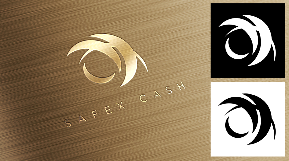
I like the interplay between the two logos. Essentially an eclipse appearance (one [safex cash] can’t do without the other [safex token]), like the moon, sun, and earth. Well done.

3 Likes

@SafeTripHome Interesting take on the interplay!

@cryptooli Yes, I also like the Blue!

@dandabek and Nikola, Nice!

2 Likes

Love the designs. Should they also be different colours like silver/gold, gold/blue?

Brilliant work, Nik.

2 Likes

Like this one, cool proposals from Nikola.

5 Likes

I like the design on both but I would add some color to it.

2 Likes

Adding the moon in the logo makes it religious looking to me, something from islam or so. The gold looks sharp👍

2 Likes

The blue works well

1 Like

the top-ranking financial websites tend toward: Trust-building colors: green and blue . High-energy colors that suggest power and authority: red and black .

Colors associated with wealth: green and gold.

3 Likes

Don’t add colour it’s perfect

1 Like

I think there is no need for the crescent in the safex cash proposal, its too busy with similar shapes already.

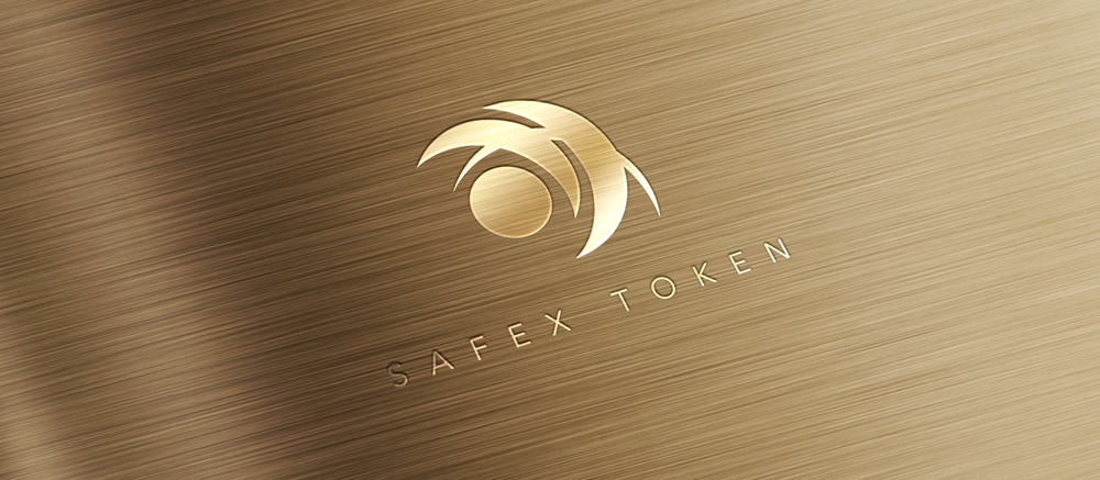
I think one should have the usual safex symbol, while the other should have the same with that circle/disk shape added (as in the above safex token proposal).

So: 1) basic safex logo + 2) basic logo with circle.

4 Likes

I think the full moon logo looks best, but I think using two logos could be confusing if the text under the logo was absent.

It could be hard for customers to tell which logo was Cash and which logo was Token if text was absent.

I think just one logo would be best to represent SafeX and just use text to distinguish between SafeX Cash and SafeX Token if required.

Though the above logo looks smart cut/stamped into the brushed gold surface I think colour needs to be introduced into the logo.

4 Likes

How about my logo

image

2 Likes

I think that the large bottom one on the left is the most memorable.

2 Likes

That’s really cool, What do the small triangles represent?

Looks interesting. Maybe a little too busy for me.

BTW is that a reflection I can see :yum:

2 Likes

I think it’s to busy, a logo should be as easy as possible

1 Like

I prefer blue over gold,…

It looks better in my option and it’s easier to. Print etc. And I think we shouldn’t forget practical usage - if a store wants to make a sign that they accept safex for payment they should not have to struggle how to print gold with there printer - else it might end with yellow on every self printed sign :nauseated_face:

1 Like

I actually think both logos look great. Id be interested to see a 3rd logo, an amalgamation of the other 2 , as the marketplace logo , then it would show the 2 logos as the comprising elements.

1 Like