The first impression would be no but would need time for it to sink in, not completely dismissable. would need more comments from all the safexians, looking at discord we wont get much from this bunch.
Hi @dandabek
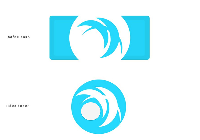
The rectangular one, maybe add a $ in the upper left corner?
Another idea is to use the circular one with the original logo, but with reeded edges for Safex Cash and without reeded edges with the dot for Safex Token.
Dan I think this new Safex Cash logo design is epic… Its retains the Safex image that everybody knows and its distinct. This logo just says ‘spend me’, which is why it seems so well suited for mainstream adoption.
I added a circle for the token like the previous token designs, seems to work well, looks great without it too.
The colour is bright and clear. It looks like the right balance between the dark blue theme and new gold theme.
Big fan of the new designs, well done!
Really liked the Gold and could add to Chief Designer, Nikola: ideas with some Morse code for edging
Hi Dan,
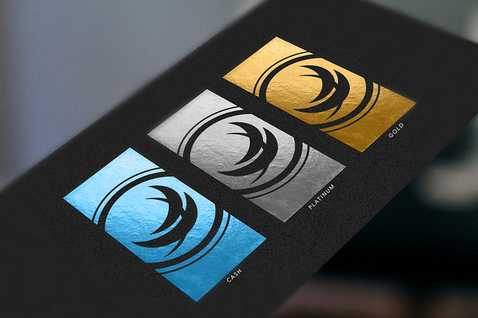
All three of those are really sharp looking!

They all look great to me, it’s hard to choose but I think I’d go with the Black on Blue.
You and your team do an amazing job “thinking outside of the box”. Well done, again!
All 3 are very impressive, ill stick with gold and cash a close second
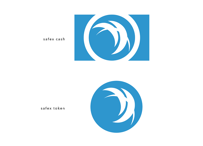
B, the darker one
I prefer light blue 
I rather A
Absolutely love them. It’s like Starwars Galactic Credit Standards. All three colours work well - love the foil finish.
I would pick a another kind of blue honestly.
Yeah already look better, the colour I would like to see is a particular tonality of turquoise at my eyes would be perfect with it
