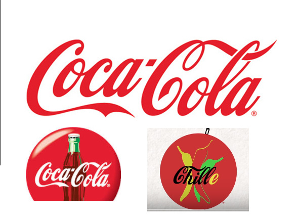
I’m glade the team is working on getting to project together but here is some constructive criticism regarding the Chille coin logo. As you can see in the image bellow, that font and logo look too much like Coca-cola and I think it’s really bad for the brand and will definitely need some re-branding of the logo. That said, I know some people also complain about the "Pirate ship on the website but personally I love it but it can of course look too much like pirate bay and be considered negatively by the general public.
That said I’m in no shape or form having any artistic skills to suggest anything better but I’m sure some people in the investors might have some of those skills and would be glad to suggest new ideas that could even been voted via our SAFEX coin share voting system once this get in place but yeah this COKE font really need to change asap Just my 2 cents. Keep up the good work!
While that means its technically a correct logo that does not infringe on the cola logo, it does not mean that it is beyond discussion whether or not it is beneficiary to have a logo so similar to that of a mayor brand. I hope we can discuss things like this in the upcoming Safex Holders Chat in the wallet instead of on the forums soon.
I’m definitely not talking about “Legality” here but just that it look too similar and that this font remind everyone of Coke and personally I hate this corporation with high devotion as any big company that market to their customers that they will be “Cool” and “Hype” for using their deadly for your health product but hey maybe that’s just me. My point here is simply that even if “Legally” the logo would have look like the McDonald logo but “Different enough to be legal” I would have said the exact same thing as these big corporation logos are known by everyone around the world and will generate both positive and negative reaction in the long run. Personally I think it’s better to come up with something “Original” that cannot be confused with anything else that already exist.
I think it’s the font used for the word Chille more than the overall logo. Change the font to something that looks less like Coke and you’ve solved the problem.
And yeah, keep the ship - it’s a mid-17th century brig, by my reckoning, many of which sailed in the French and British navies during the Napoleonic wars, so potentially quite the opposite of pirates. And I love the sails in the Safex logo
I personally love the logos. Safex reminds me of SpaceX and Chille reminds me of CocaCola. Two very successful companies. Enough familiarity to make them recognizable but enough uniqueness to tell you this is something new.
Yeah its a pretty straight ripoff of the coke logo. Seems pretty random. Maybe the devs will explain it. As long as they’re better at software than marketing I don’t really care what the logo is. At least they didn’t ripoff Chipotle.
Honestly, the similarities don’t bother me at all. I like that it’s distinctly different from the Safex logo. As Chille will be its own entity. But, if anyone has a better idea I’m sure we would all love to hear it.
The masses should stick with Dash who’s stated goal is to appeal to masses. SafeX should stay true to themselves and appeal to those on it’s ship who are ready to explore the new world. If people want to avoid the challenges of exploration then let them stay home on dry land and let them eat cake.
Yes, this is one of the first things that stood out. Logo just like coke’s. Cheezy to do that came to mind. Come on change it… You still have time. Take ownership of your own unique product.
Agree completely, SAFEX is better than that, we don’t need subliminal recognition to one of the worlds most toxic food/drink companies in the world…time for a sexy new logo to match the new SAFEX logo…this Chilli one is dated and unprofessional
I would suggest to simply use the Charater C, because C is the one after B which stands for bitcoin. The same thing happens in the history of programming language. There is B language then comes the famous C language. purely revolutionary
Yeah, good idea. I do not how to do the graphics, but it could be something like-----Only one letter “C” in a form of a chilli. It can represent both coin and word chilli along with your interpretation of languages.
As a graphic designer, I can say that the logo is clearly associated with the restaurant business / drinks / fast food, something cute, frivolous.
The logo is definitely better to change. For a serious company you need minimalism, simplicity, uniqueness
 Just my 2 cents. Keep up the good work!