I hold my ground regarding the letters being applicable.
2 Likes
It looks really cool, but kinda like an eye, of we take something like this the conspiracy people will cry: illuminati and freemasons created the safex cash to take away paper money and they’ll prove that with the all seeing eye in our logo…
I don’t know if that will hurt or maybe even benefit us, but one great costumer group in a decentralized market place would be thous conspiracy people…
It’s always hard to way everything in and depending on the different cultures on the world we get different associations, but I think the cash logo should be as easy, memorable and minimalistic as possible. The original safex logo is great so far, maybe adding text, maybe not, but the more we put in the more hidden messages could be read out of it misinterpreted by one or the other culture
3 Likes
Perhaps your opinion is correct, there will always be conspiracy and especially with crypto. We are decentralised so conspire all they want.
1 Like
I like the concept of the sails, and i think also Token and Cash should have a similar theme behind them but different logos not similar different.
2 Likes
@dandabek I was looking closely at the original Safex Logo, which I like very much.
And I was thinking, what about an image of the Milky Way Galaxy spiralling under the three Cresents, or maybe an image of the Solar System, or the Sun?
Or an image of a marketplace under the Cresents?
Maybe too crazy, but I figure we should explore all ideas.
3 Likes
Original logo is the way to go on my shortcut logo is good everyone knows it just put a $ sgin for the cash Cha Ching let’s roll
2 Likes
@Jamesie05 kinda agree with you, but let’s keep the idea open and see. Some of the suggestions should be at least considered and its good to be debating for a final decision, also good of @dandabek who gave everyone the opportunity to be involved.
2 Likes
I agree with this. We already have safex logo, which is imo quite good and relatively known in crypto. Just add some symbol to it for safex cash and thats it.
And Id be a bit careful about strange symbols, moon, space, galaxies and such. Safex is building a trading/commerce platform, and the design should reflect this.
The existing dark/space/moon style is already pushing it. Is it cool looking? Sure. Does it have anything to do with trade, being connected globaly, decentralisation, commerce and such? Not really.
In one of the previous articles/updates there was a great lighter color design/style, unfortunately I didnt save it. I really hope that for the marketplace app we will move from the space/moon theme to something more mature and suitable.
3 Likes
I like it.
Pls don’t get my previous comment wrong, a high tech/sci-fi style can work, as long as it all fits together nicely within the overall design and functions of the marketplace app.
EDIT: here’s one basic lighter style I’ve found:

And the gold/blue/white theme could also work, if done in a sufficiently elegant way:
How it would be usually done is that the designer would make several mock-up proposals based on the marketplace app concept (so the design can fit the expected functions) and then a decision can be made.
It’s really very hard to judge a certain design element without seeing how it all fits together.
2 Likes
nicely put @Boris_S, I would assume a decision would be made before 28th or maybe not until we go on a major exchange or even later when the marketplace is up and running.
1 Like
Time is pressing for this decision.
1 Like
Do you maybe have some mock-ups to share of the overall designs for the marketplace app? So not just the logo, but the menus, screens and such.
1 Like
@boris_s we do not have mock ups to share yet; step by step

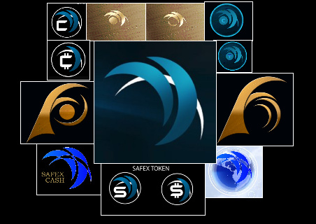
I propose this left one is safex cash and right side is safex token
5 Likes
@dandabek @Boris_S Agree with both, the one on the left has little change from original and would not confuse newcomers. The one on the right will be easily conveyed.
2 Likes
I have one more idea
2 Likes
Cash is top one with those things flanking the logo so its rectangluar
and safex token is the bottom one
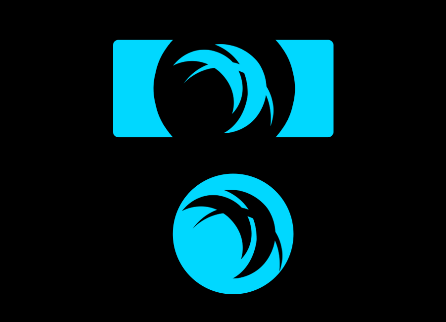
7 Likes
The first impression would be no but would need time for it to sink in, not completely dismissable. would need more comments from all the safexians, looking at discord we wont get much from this bunch.
2 Likes
Hi @dandabek
The rectangular one, maybe add a $ in the upper left corner?
Another idea is to use the circular one with the original logo, but with reeded edges for Safex Cash and without reeded edges with the dot for Safex Token.